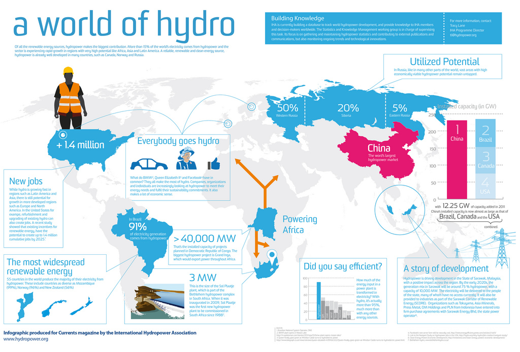
Infographics allow audiences to visualize information. A chart, a diagram, or a picture can all be incorporated into an infographic to maximize the flow of information. Abstract shapes allow users to highlight keywords or connect information in terms of themes. The “stackability” of these images makes them easy to read, upping the “shareability” of these infographics across online reading platforms.
The following sections provide an overview of Processes, Tips & Examples, Tools, and Resources for working with images.
With so many shapes, colors, and pieces of data to play with, how should you start designing your infographic?
According to CDEx partner Whitney James, you can approach the design of an infographic with a plan, some play, and then put it away.
Plan
Before you begin to design, James recommends creating a plan. She said, “First, you need to take some time to really gather all of your data and get a clear idea of what you want to include in your infographic and organize the information. If you don’t, just going into the infographic will be so overwhelming and creating it will take a lot longer.”
In many ways, James’s advice applies to most all new media projects. Stepping away from the technology and planning on a piece of paper ensures that you, as the user, don’t become lost in the endless possibilities of new media. Save yourself time. Begin with a plan.
Play
As you transition from planning to playing with the possibilities for design, you might find you’ve changed your mind about what you want to present in your infographic.
James recommends, “Allowing yourself to play around and have fun is important too, particularly when choosing how to represent with charts and icons. Being a little open-minded and approaching it as a fun activity really helps.”
Keep track of time while you play and return to your plan as needed, though, or else the technology might consume more free time than you’d like to give.
Put It Away
When do you know you’re finished? That’s a difficult question to answer.
For James, this last step requires users to “stop tweaking” the infographic, which she describes as “the hardest part.“ A helpful way to quit tweaking is to step away from the infographic and return to it the following day with fresh eyes. Upon returning, scroll through what you’ve created and note opportunities to be less text-heavy in wordier sections of the infographic. What could you condense? What do you consider the most important part of the piece and how can you highlight that to make it look larger and more important?
Depending on the purpose of the infographic, you may be able to revise the image at a later date.
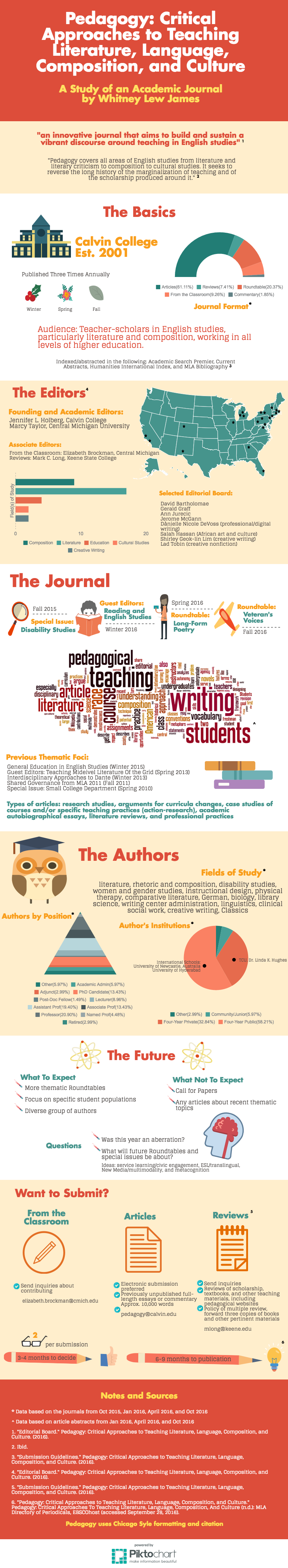
To see an infographic created by James, click over to the next section, Tips & Examples.
- Know your audience.
- What are your viewers more likely to share? What information do they want? Where will they seek out this information? What key terms will you define for them? Take a quick inventory of your viewers’ needs before planning your infographic.
- Read other infographics.
- One of the best search engines for locating infographics is Pinterest. You can create a free account through your Facebook profile or create an email log-in. Search for a keyword of your choosing and add “infographic” after the keyword. To get a fresh perspective on your own infographic, note what styles or patterns of image stacking you’d like to emulate.
- Avoid chart junk.
- When trying to decide whether to add another chart or not, ask yourself if you should. Just because we can make a chart doesn’t mean we should. Would the information in the chart be more useful if taken out of the chart and visualized in a different way? Don’t let your entire infographic become a chart zoo.
- Use negative space purposefully.
- Many designers like to eliminate as much negative space as possible. If you’re leaving negative space, consider if leaving that space empty gives the eye a moment to breathe while traveling across your infographic. If we need a little space to break up text, include more space. If we don’t, what might you add that enhances the visual argument of proximal features in the infographic?
- Have a headline.
- If someone finds your infographic on Pinterest or another search engine, will the headline be enough to draw that person in? Because infographics are large and require scrolling, the headline may make all the difference when it comes to engaging readers.
- Color correctly.
- Templates give predetermined color wheels for you to work from, but you can change the color as you add in text. Your infographic shouldn’t become a multicolored milieu of experimentation. Stick to four or five key colors. If you’re starting from scratch and not sure what colors to choose, play with Adobe’s Color Wheel to see what works.
- Set time limits.
- It might sound unnecessary, but once you start tweaking it’s hard to stop. Giving yourself a start time and a stop time will save you hours in the long run.
- Backup content.
- You may want to keep an alternate storage system for archiving the content or images you add. Most online tools save your design automatically and maintain a gallery system for storing images you’ve used. Even so, save frequently and often in case a server goes down.
Examples
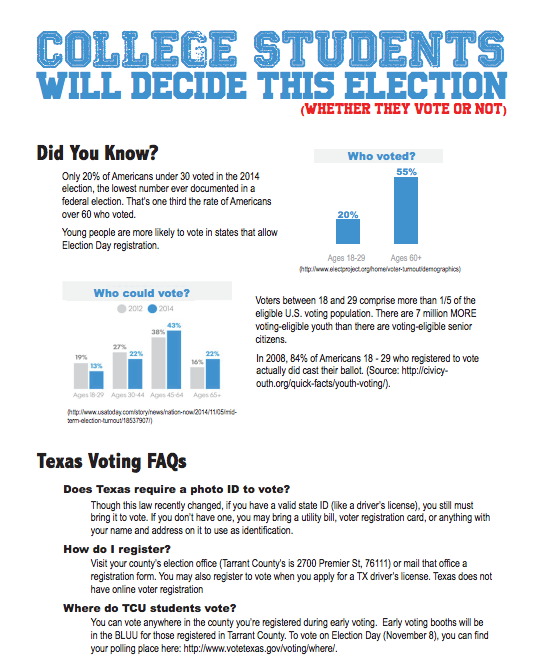
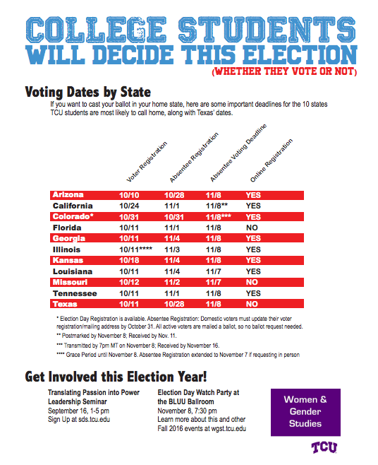
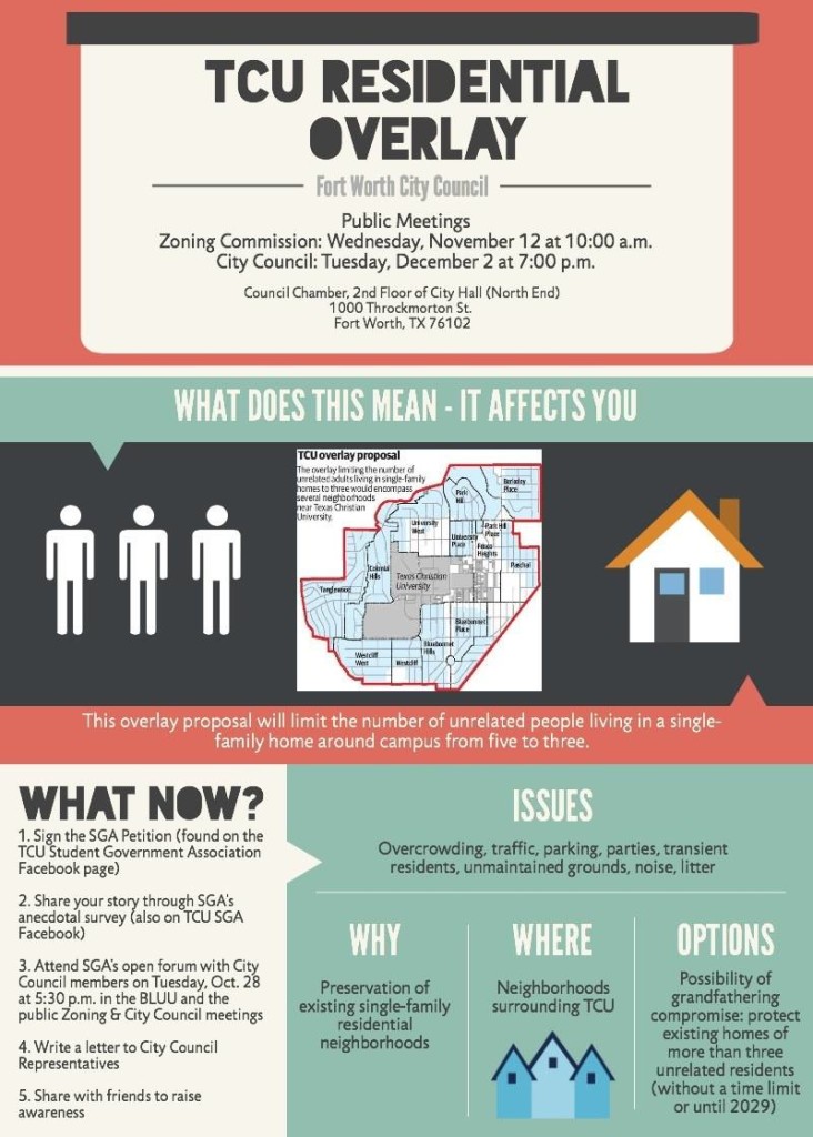
Dr. Jason Helms, English and Women & Gender Studies
Need to find a color wheel?
Try out color patterns using Adobe’s Color Wheel. Spin the wheel and drag the bars until you find a set of five colors that enhance the message of your piece.
Need to find copyright-free images?
CDEx > Tech > Images > Images Resources
Tip: On Flickr, type in search type and then change the license type to “Creative Commons only.” You must use their downloader tool because you can’t right-click on a photo to download it (their downloader tool = the down arrow over a flat line).
Photoshop Tutorial: Make Background Transparent
Try to use this before importing an image to Piktochart.
TCU Resources
- Fact Books via TCU’s Office of Institutional Research
- TCU’s Photo Library
- TCU at a Glance
- TCU 360
Infographic tools abound. CDEx staff members have had great success with all of these tools:
There are plenty of others to choose from, and some designers even use Microsoft PowerPoint, but these five have useful templates for newbies.
The costs associated with blogging can be free to minimal. If you’re willing to pay for a subscription, most infographic services will give you additional exporting options, i.e. saving your infographic as a .jpeg and a PDF. Before deciding on which tool to use, take a free tour or tutorial of the tool’s services. Depending on your audience, you may need to require a tool that allows you maximum capabilities for exporting to help readers view your infographic on web pages, in documents, or on Pinterest.